
Loading

Search
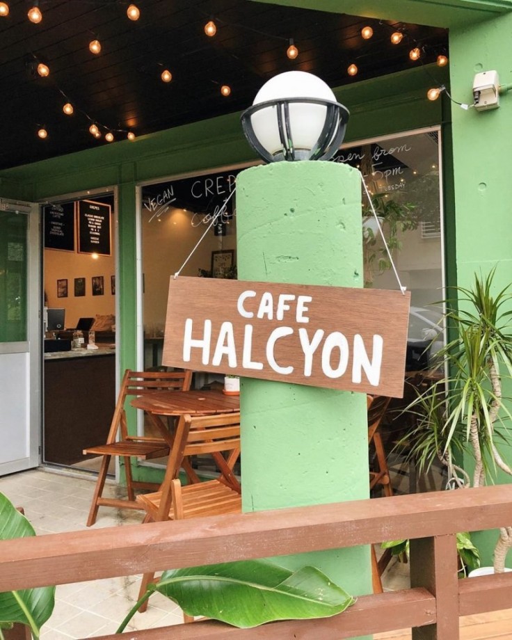
▼ Cafe Halcyon
- Category:Cafe
JAPAN TRAVEL
Vegan Crepes, Sandwiches, And More In Okinawa
Crepes are a favorite dessert across Japan, but since the typical ingredients for crepe batter include eggs and milk it rules them out for vegans. Okinawa's Cafe Halcyon has remedied that, serving up a range of delicious vegan-friendly crepes and cementing themselves as a much-loved part of the prefecture's vegan eating scene.

There are numerous crepes available at Cafe Halcyon, in both sweet and savory varieties. For the sweet options, there are choices like the banana nut crepe (homemade chocolate nut butter, freshly whipped soy cream, bananas, and almond slices), the PB + choco crepe (homemade chocolate nut butter, peanut butter, bananas, and freshly whipped soy cream), or the lemon sugar crepe (organic lemon juice, sugar, and organic agave) to name a few.


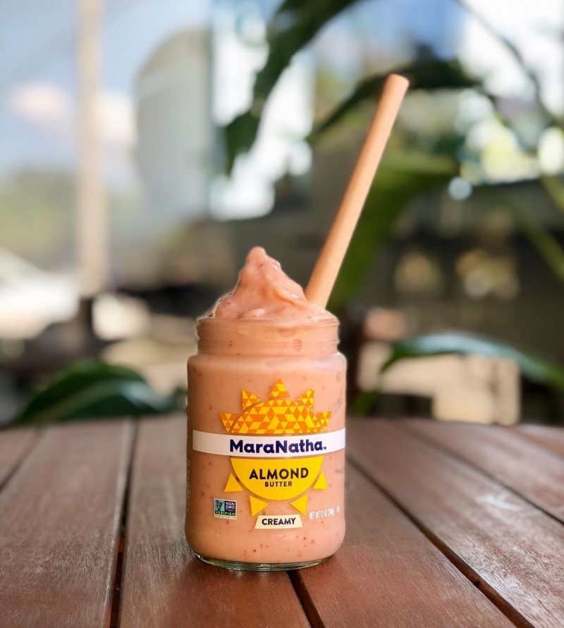
When it comes to the drinks, coffees can be served with your choice of almond or soy milk, and there are smoothies in berry, tropical, or chocolate flavors. The cafe places a real focus on sustainability, and they reuse almond butter jars to serve the smoothies in. A nice win for the environment as well as your taste buds.

Getting there
Cafe Halcyon is located in Chatan, Okinawa Prefecture, across from the Sunabe Sea Wall. It's approximately a fifteen minute drive from the Okinawa-Minami Interchange on the Okinawa Expressway, or a five minute drive from Gate 1 at Kadena Air Base.By Kim B
- May 22, 2020
- Comment (12537)
- Trackback(0)
Comment(s) Write comment
Across prototype UI reviews focused on clean and minimal commerce layouts, researchers noted strong sunlight themed design consistency but missing informational depth in critical modules such as a href="[https://sunharborvendorroom.shop/](https://sunharborvendorroom.shop/)" />sun harbor vendor room entry node</a> where the surrounding interface feels structured yet hollow, and the Sun harbor concept appears visually appealing while still lacking actual descriptive content inside the vendor room section itself
-
Edmundwab Web Site
- 26/4 04:49
Users exploring e commerce platforms often note that clean interfaces encourage longer browsing sessions, particularly when they find <a href="https://floraridgevendorroom.shop/" />Floraridge Retail Hub Link</a> – The browsing experience is described as more efficient, with better organized product groupings and improved accessibility that supports quicker decision making
-
WilliamVag Web Site
- 26/4 04:45
While browsing through curated listings and various online suggestions, I found something that seemed easy to navigate and trustworthy, especially where <a href="https://iciclebrookmarketroom.shop/" />this structured browsing entry</a> appeared – the design is simple and reliable, so I might come back later for more exploration.
-
GregoryWen Web Site
- 26/4 04:41
While auditing ecommerce UI kits focused on coastal and dune themed galleries, reviewers pointed out that <a href="https://dunecovemarketgallery.shop/" /> coastal dune gallery market entry node this section reappears with near identical styling across pages, reinforcing a sense of autogenerated AI template spam rather than a thoughtfully designed interface overall
-
ErnestLak Web Site
- 26/4 04:16
While examining different e-commerce gallery concepts and vendor platform layouts for inspiration and usability comparison <a href="https://pearlcovemarketgallery.shop/" />Pearl Cove curated market space</a> the browsing flow felt structured and steady allowing me to explore content without any unnecessary distractions or complexity. – Everything loaded quickly and the interface remained organized which improved the overall experience
-
AntonioSpili Web Site
- 26/4 04:04
During exploration of digital product showcase systems and marketplace directory concepts for design evaluation and inspiration across multiple examples <a href="https://dunemeadowvendorparlor.shop/" />Dune Meadow product showcase link</a> navigation stayed fluid and content was easy to browse without confusion – Clean structure with fast page loads and stable interface performance overall
-
WilliamSnoma Web Site
- 26/4 03:58
While going through multiple vendor marketplaces and commerce hubs, I came across several entries with nearly identical branding structures, especially <a href="https://alpineharborvendorhall.shop/" />Alpine harbor vendor commerce hall link</a> – It felt like I was seeing a duplicate store again and again, creating a strong déjà vu effect.
-
Michaelskync Web Site
- 26/4 03:40
Across QA testing of experimental online storefronts analysts repeatedly find embedded links within structured page sections <a href="https://driftorchardvendorhall.shop/" /> drift orchard shop terminal</a> that looks like a proper entry point but results in a minimal interface displaying only a couple of products without full category support – The aesthetic is soft and natural but functionality feels incomplete
-
Michaelses Web Site
- 26/4 03:28
While researching structured vendor collective websites and their product listings, I explored <a href="https://oakmeadowvendorcollective.shop/" />browse oak meadow artisan collective</a> – The product photos are clean and well presented, and the descriptions add useful context that improves browsing experience.
-
HarryNeply Web Site
- 26/4 03:18
While going through multiple niche listing directories and discovery threads, I found something that seemed well organized and efficient, especially where <a href="https://ivoryharborvendorroom.shop/" />Ivory harbor entry page</a> appeared – Looks professional overall, and I might recommend this to others as well since it gives a smooth and straightforward browsing experience.
-
DerrickSen Web Site
- 26/4 03:12
<a href="https://wheatmeadowmarketroom.shop/" />wheatmeadowmarketroom.shop</a> – Clean layout and simple navigation, makes exploring content really enjoyable.
-
RandomNameRen Web Site
- 26/4 03:07
People who prefer handcrafted shopping platforms often explore sites like <a href="https://fernridgeartisanmarket.shop/" />Ridge Fern Artisan Marketplace Hub</a> where items are arranged in a simple and organized design – The interface makes browsing feel smooth, intuitive, and visually appealing while exploring handmade goods.
-
RandomNameRen Web Site
- 26/4 02:54
While analyzing sandbox ecommerce marketplaces and UI vendor gallery systems, testers identified embedded sections containing <a href="https://plumcovegoodsgallery.shop/" /> plum cove vendor gallery goods showcase node</a> integrated into page hierarchy, and although the plum branding suggests a rich visual identity, the UI is largely gray which creates a dull impression during interaction testing and evaluation cycles
-
Carlosfeept Web Site
- 26/4 02:51
Across ecommerce sandbox UI evaluations and vendor system prototypes, testers noticed navigation components containing <a href="https://solarorchardmarkethouse.shop/" /> solar orchard vendor market house access hub node</a> embedded in page flow, and although the orchard solar concept implies trust and growth like a healthy marketplace ecosystem, the missing checkout security seals reduce user assurance during usability testing cycles
-
AnthonyCoing Web Site
- 26/4 02:49
ThomasCab Web Site- 26/4 04:52