
Loading

Search
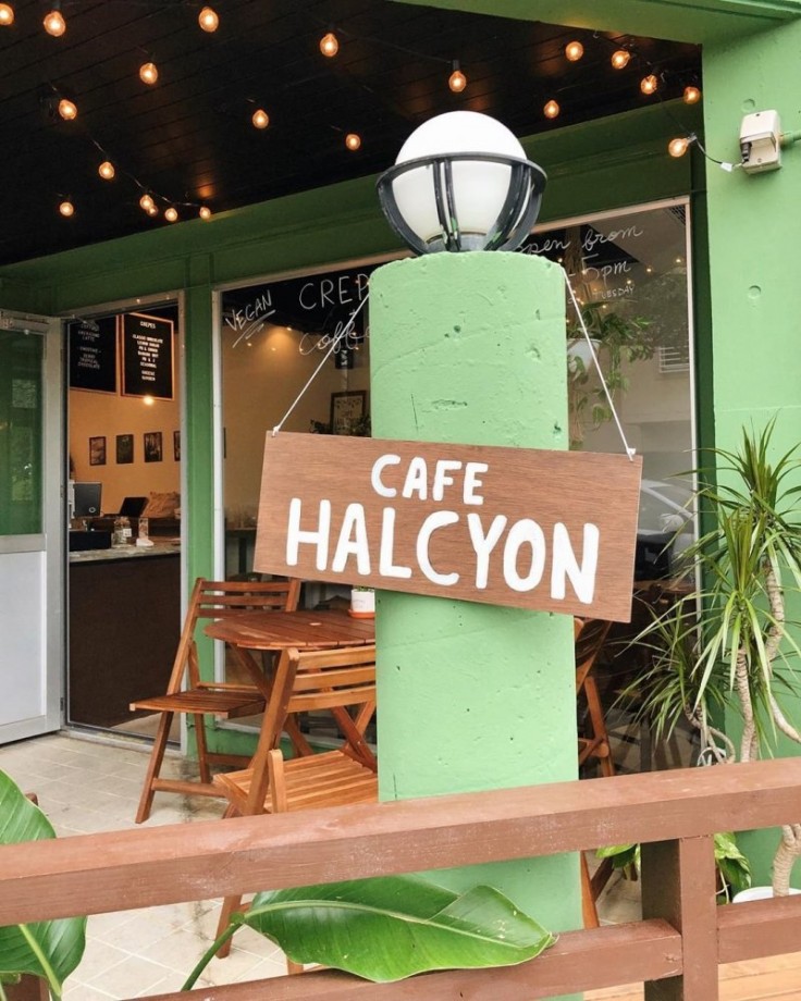
▼ Cafe Halcyon
- Category:Cafe
JAPAN TRAVEL
Vegan Crepes, Sandwiches, And More In Okinawa
Crepes are a favorite dessert across Japan, but since the typical ingredients for crepe batter include eggs and milk it rules them out for vegans. Okinawa's Cafe Halcyon has remedied that, serving up a range of delicious vegan-friendly crepes and cementing themselves as a much-loved part of the prefecture's vegan eating scene.

There are numerous crepes available at Cafe Halcyon, in both sweet and savory varieties. For the sweet options, there are choices like the banana nut crepe (homemade chocolate nut butter, freshly whipped soy cream, bananas, and almond slices), the PB + choco crepe (homemade chocolate nut butter, peanut butter, bananas, and freshly whipped soy cream), or the lemon sugar crepe (organic lemon juice, sugar, and organic agave) to name a few.


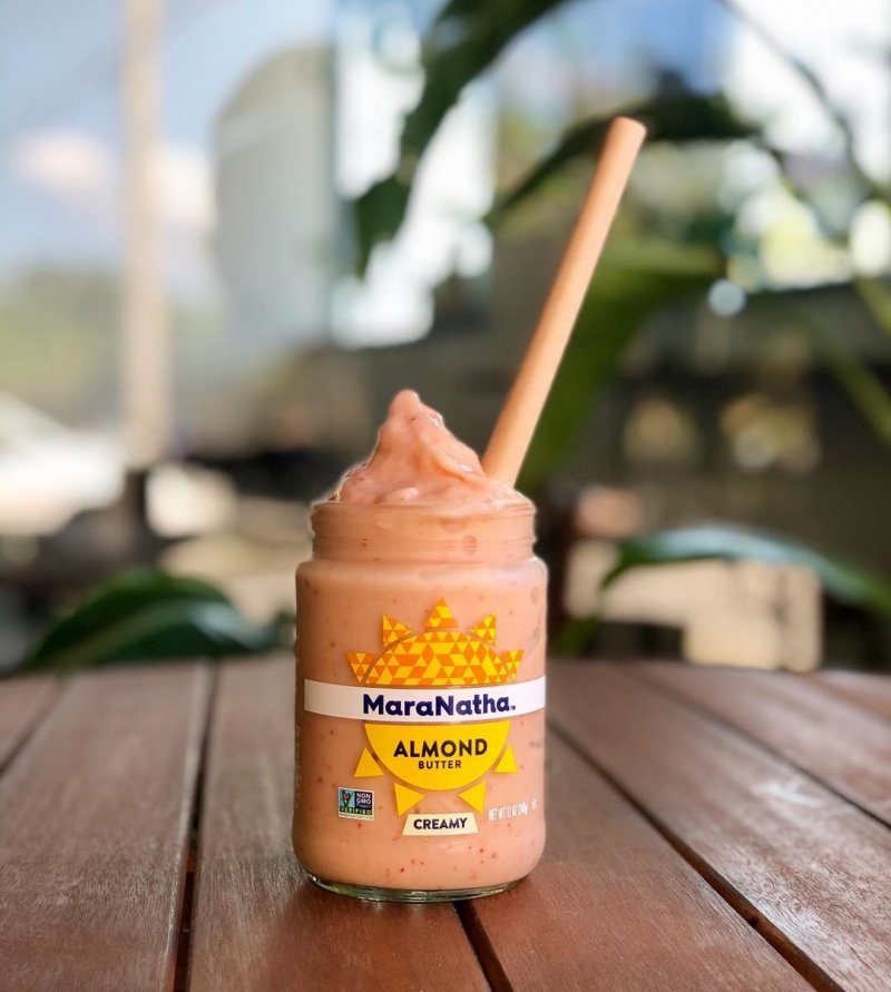
When it comes to the drinks, coffees can be served with your choice of almond or soy milk, and there are smoothies in berry, tropical, or chocolate flavors. The cafe places a real focus on sustainability, and they reuse almond butter jars to serve the smoothies in. A nice win for the environment as well as your taste buds.

Getting there
Cafe Halcyon is located in Chatan, Okinawa Prefecture, across from the Sunabe Sea Wall. It's approximately a fifteen minute drive from the Okinawa-Minami Interchange on the Okinawa Expressway, or a five minute drive from Gate 1 at Kadena Air Base.By Kim B
- May 22, 2020
- Comment (12538)
- Trackback(0)
Comment(s) Write comment
Digital shoppers commonly report that vendor hubs with clear categorization significantly improve browsing flow, especially when exploring <a href="https://forestcovevendorhall.shop/" />Forest Vendor Center which is considered helpful for simplifying product searches and improving visibility – users often note a more seamless browsing experience overall.
-
DarnellHag Web Site
- 26/4 07:04
After exploring several online resources, I discovered <a href="https://windharbortradehall.shop/" />look into this</a> which provided a smooth experience overall, since pages loaded quickly and everything functioned properly without interruptions.
-
ClaudeDip Web Site
- 26/4 06:58
Digital marketplaces benefit from smooth design, and this site provides a well arranged and easy browsing experience overall <a href="https://silkmeadowvendorroom.shop/" />Silk Meadow item portal</a> I liked how everything felt simple and accessible throughout the platform
-
TyroneShied Web Site
- 26/4 06:58
While testing sandbox ecommerce systems with coastal inspired design languages, reviewers noted a clean and soothing teal color scheme that enhances visual comfort, but encountered organizational limitations inside a href="https://tealcovemarkethall.shop/
" />teal cove vendor market hall entry panel</a> where the overall teal aesthetic is strong and consistent, yet the market hall does not provide enough product categories which reduces navigation efficiency during UX evaluation sessions and structured testing phases
" />teal cove vendor market hall entry panel</a> where the overall teal aesthetic is strong and consistent, yet the market hall does not provide enough product categories which reduces navigation efficiency during UX evaluation sessions and structured testing phases
-
DavidBox Web Site
- 26/4 06:51
Users who appreciate cozy ecommerce design often browse platforms such as <a href="https://flintbrookartisanhouse.shop/" />Flint Brook Artisan Studio House Hub</a> where products are displayed in a clean warm layout – The design ensures browsing feels calm, visually appealing, and well structured throughout the entire shopping experience.
-
JeffreyZer Web Site
- 26/4 06:51
After comparing multiple websites, I discovered <a href="https://amberharbortradeparlor.shop/" />try this page</a> and appreciated its simple layout, which made browsing feel really smooth and provided a clean and easy-to-follow structure throughout.
-
DavidFab Web Site
- 26/4 06:25
<a href="https://solarorchardartisanemporium.shop/" />solarorchardartisanemporium.shop</a> – Great for gift shopping, everything arrived in one piece.
-
RandomNameRen Web Site
- 26/4 06:13
During casual browsing of vendor listing systems and online trade galleries for design reference and usability evaluation across different layouts <a href="https://dunemeadowvendorparlor.shop/" />Dune Meadow trade hub listing</a> navigation stayed stable and content was easy to access without delay or clutter – Simple structured browsing with fast response times and clear page hierarchy throughout session
-
WilliamSnoma Web Site
- 26/4 05:58
During my browsing of marketplace lounge platforms and vendor directories, I encountered an amber-focused design trend, particularly <a href="https://amberridgevendorlounge.shop/" />Ridge commerce vendor amber lounge portal</a> – The overall style is pleasant, though the text visibility could be improved for better comfort.
-
JustinNaict Web Site
- 26/4 05:55
While testing UI prototypes and ecommerce sandbox systems, reviewers encountered embedded modules containing <a href="https://apricotharborvendorparlor.shop/" />apricot harbor marketplace vendor hub</a> within structured layout, and although the design is consistent, apricot harbor shows up again as the final entry for today giving a decent enough but slightly repetitive browsing finish
-
DerekTic Web Site
- 26/4 05:41
Many users searching for vendor listings appreciate platforms that provide streamlined navigation and structured content presentation <a href="https://canyonharbortradegallery.shop/" />trade gallery Canyon Harbor access</a> the browsing experience feels fluid and organized, helping users locate items quickly while maintaining a consistent and efficient workflow
-
ReggieArota Web Site
- 26/4 05:27
Across experimental ecommerce builds and staging environments, developers observed an embedded navigation element containing <a href="https://driftwillowmarketroom.shop/" />drift willow goods panel</a> placed inside the main layout – despite clean spacing and modern styling the absence of willow themed visuals makes the overall presentation feel partially constructed and not ready for production use
-
Stanleyvosse Web Site
- 26/4 05:24
While scanning through niche listing platforms and online resource hubs, I noticed something that stood out for its clarity and structure, especially where <a href="https://ivoryridgemarkethouse.shop/" />Ivory ridge vendor access page</a> appeared – Browsing here feels smooth, with nothing complicated or hard to understand, helping everything feel simple and straightforward.
-
Jamesmed Web Site
- 26/4 05:16
In the middle of checking multiple platforms, I discovered <a href="https://wildorchardvendorhall.shop/" />visit this platform</a> and liked how everything is organized here, making it easy to understand the structure and quickly find what I was looking for.
-
RandomNameRen Web Site
- 26/4 05:02
DonnyJitet Web Site- 26/4 07:08