

▼ University of Tokyo keeps No. 23 world ranking
- Category:Other
NEWSONJAPAN.com
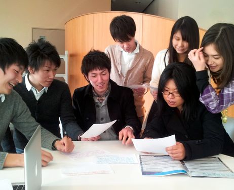
The University of Tokyo maintained its position in global university rankings at 23rd, but four other Japanese universities in the top 200 saw their rankings drop from 2013, according to the British magazine Times Higher Education.
Todai was ranked the highest among the Asian institutions, and the number of Japanese universities listed in the top 200 outnumbered those of other Asian nations.
But other domestic universities ranked in the 200 all saw their rankings decrease from the previous year - Kyoto University from 52nd to 59th, Tokyo Institute of Technology from 125th to 141st, Osaka University from 144th to 157th and Tohoku University from 150th to 165th.
- October 9, 2014
- Comment (16483)
- Trackback(0)
Comment(s) Write comment
tadalafil reviews <a href=https://engtadafii.com/>tadalafil online canada</a> sildenafil vs tadalafil
-
Bswgycle Web Site
- 15/5 20:11
Соблюдение конфиденциальности в клинике «Точка Опоры» является неотъемлемой частью лечебного процесса. Наркологическая клиника в Краснодаре обеспечивает закрытый формат приёма, хранения медицинских данных и взаимодействия с пациентом. Практика показывает, что анонимное обращение снижает уровень тревожности, способствует более открытому диалогу с врачом и повышает точность клинической диагностики.
Получить больше информации - https://narcologicheskaya-klinika-v-krd19.ru/krasnodar-narkologicheskij-czentr/
Получить больше информации - https://narcologicheskaya-klinika-v-krd19.ru/krasnodar-narkologicheskij-czentr/
-
Jerryfrors Web Site
- 15/5 18:12
Помощь при зависимостях в клинике «Южный Вектор» базируется на клинической диагностике, позволяющей определить стадию расстройства и сопутствующие нарушения. Наркологическая клиника в Ростове-на-Дону уделяет внимание не только купированию острых проявлений, но и стабилизации соматических показателей. Такой подход снижает риски осложнений и формирует условия для дальнейших этапов терапии. Медицинская практика подтверждает, что отсутствие системности приводит к краткосрочному эффекту и рецидивам.
Узнать больше - [url=https://narkologicheskaya-klinika-v-rnd19.ru/]вывод наркологическая клиника в ростове-на-дону[/url]
Узнать больше - [url=https://narkologicheskaya-klinika-v-rnd19.ru/]вывод наркологическая клиника в ростове-на-дону[/url]
-
WilliamRhymn Web Site
- 15/5 17:26
В таблице ниже представлены основные группы препаратов, применяемых при выведении из запоя:
Получить дополнительные сведения - http://vyvod-iz-zapoya-v-krasnodare19.ru/vyvod-iz-zapoya-krasnodar-otzyvy/https://vyvod-iz-zapoya-v-krasnodare19.ru
Получить дополнительные сведения - http://vyvod-iz-zapoya-v-krasnodare19.ru/vyvod-iz-zapoya-krasnodar-otzyvy/https://vyvod-iz-zapoya-v-krasnodare19.ru
-
Antoniodah Web Site
- 15/5 17:09
mylan-tadalafil <a href=https://engtadafii.com/>mambo 36 tadalafil 20 mg</a> tadalafil cost walmart
-
Bswgycle Web Site
- 15/5 13:15
liquid tadalafil dosage <a href=https://engtadafii.com/>tadalafil online pharmacy</a> tadalafil vs sildenafil
-
Bswgycle Web Site
- 15/5 13:07
what is the difference between cialis and viagra <a href=https://aiciliss.com/>cialis 100mg</a> cialis pills
-
Bvdgycle Web Site
- 15/5 12:52
букмекерские конторы Узбекистана [url=https://cah.forum24.ru/?1-0-0-00000166-000-0-0]букмекерские конторы Узбекистана[/url]
-
BK Yzbekistan_opKn Web Site
- 15/5 12:02
заказать кухню цены [url=https://zakazat-kuhnyu-21.ru]заказать кухню цены[/url]
-
zakazat kyhnu_csSt Web Site
- 15/5 11:57
кухни на заказ в спб [url=https://kuhni-spb-58.ru]кухни на заказ в спб[/url]
-
kyhni SPb_uzOl Web Site
- 15/5 11:22
what is cialis used for <a href=https://aiciliss.com/>canadian pharmacy cialis</a> generic cialis online
-
Bvdgycle Web Site
- 15/5 11:16
вывод из запоя цены самара [url=https://kapelnicza-ot-pokhmelya-samara-23.ru]вывод из запоя цены самара[/url]
-
Kapelnica ot pohmelya_bgKl Web Site
- 15/5 11:11
заказать кухню в спб от производителя [url=https://kuhni-spb-61.ru]заказать кухню в спб от производителя[/url]
-
kyhni SPb_hlEn Web Site
- 15/5 10:34
tadalafil vs cialis <a href=https://aiciliss.com/>how long does cialis take to work</a> generic cialis online
-
Bvdgycle Web Site
- 15/5 09:24
Bswgycle Web Site- 15/5 21:36