
Loading

Search
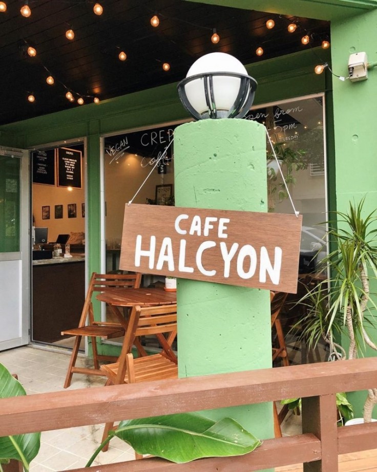
▼ Cafe Halcyon
- Category:Cafe
JAPAN TRAVEL
Vegan Crepes, Sandwiches, And More In Okinawa
Crepes are a favorite dessert across Japan, but since the typical ingredients for crepe batter include eggs and milk it rules them out for vegans. Okinawa's Cafe Halcyon has remedied that, serving up a range of delicious vegan-friendly crepes and cementing themselves as a much-loved part of the prefecture's vegan eating scene.

There are numerous crepes available at Cafe Halcyon, in both sweet and savory varieties. For the sweet options, there are choices like the banana nut crepe (homemade chocolate nut butter, freshly whipped soy cream, bananas, and almond slices), the PB + choco crepe (homemade chocolate nut butter, peanut butter, bananas, and freshly whipped soy cream), or the lemon sugar crepe (organic lemon juice, sugar, and organic agave) to name a few.


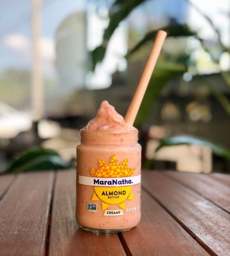
When it comes to the drinks, coffees can be served with your choice of almond or soy milk, and there are smoothies in berry, tropical, or chocolate flavors. The cafe places a real focus on sustainability, and they reuse almond butter jars to serve the smoothies in. A nice win for the environment as well as your taste buds.

Getting there
Cafe Halcyon is located in Chatan, Okinawa Prefecture, across from the Sunabe Sea Wall. It's approximately a fifteen minute drive from the Okinawa-Minami Interchange on the Okinawa Expressway, or a five minute drive from Gate 1 at Kadena Air Base.By Kim B
- May 22, 2020
- Comment (12712)
- Trackback(0)
Comment(s) Write comment
While browsing through different online resource collections and niche listing pages, I found something that seemed structured and approachable, especially when seeing <a href="https://honeycovevendorroom.shop/" />Honey vendor cove link</a> included – First impression is nice, and the content looks relevant and easy to read, making the browsing experience smooth and comfortable.
-
Robertadhes Web Site
- 25/4 16:48
During a routine scan of online vendor sites I came across <a href="https://kettleharbormarkethouse.shop/" />Kettle Harbor shopping network portal</a> – The branding is attractive and playful, but several footer links do not work, making the site feel less polished and somewhat unfinished overall.
-
Michaelunfic Web Site
- 25/4 16:46
While reviewing experimental ecommerce systems and UI vendor frameworks, testers observed embedded content blocks containing <a href="https://valeharborvendorparlor.shop/" /> vale harbor vendor parlor showcase hub link</a> inside layout flow, and although the vale harbor concept feels scenic and coastal, the parlor section is completely empty which makes the platform feel abandoned during testing and UX review cycles
-
Billydaf Web Site
- 25/4 16:45
Online shoppers exploring stylish e commerce platforms frequently seek smooth navigation and appealing visuals, and during such exploration they might come across <a href="https://suncovecommerceatelier.shop/" />suncove boutique commerce space</a> showcasing various products and – it provides a user centered design that enhances both browsing comfort and shopping efficiency.
-
EugeneEmage Web Site
- 25/4 16:33
As I browsed through different online directories and collections, I came across something that seemed visually clear and well-structured, particularly with <a href="https://gladeridgemarkethouse.shop/" />this intuitive design</a> – it makes browsing feel effortless, so I’ll check it again later.
-
RichardTop Web Site
- 25/4 16:32
While exploring a variety of artisan-focused online outlets and reviewing how creative presentation affects user experience, I came across <a href="https://goldentrailartisanoutlet.shop/" />discover golden trail artisans</a> – The layout feels thoughtfully curated, and each item is displayed in a visually appealing and well-organized manner that makes browsing enjoyable.
-
Lonniewit Web Site
- 25/4 16:21
During a comparison of modern retail district websites and their design quality, I came across <a href="uplandcoveretaildistrict.shop" />discover upland cove commerce district</a> – The interface feels clean and structured, and it is comfortable to browse without confusion or overwhelming design elements.
-
RandomNameRen Web Site
- 25/4 16:03
As I reviewed examples of online craft marketplace systems, I checked <a href="https://uplandharborcraftmarketplace.shop/" />see upland harbor artisan hub</a> – Navigation could be improved, but the products are unique and cool, making the experience still engaging.
-
DavidCoumn Web Site
- 25/4 15:58
While examining avant-garde ecommerce designs and interactive website frameworks, users frequently encounter references embedded in <a href="https://crystalcovegoodsroom.shop/" /> Crystal Cove virtual goods room – the environment feels immersive in design terms, yet the absence of listed products creates a sense of digital emptiness and conceptual ambiguity
-
Richardner Web Site
- 25/4 15:49
During a casual review of niche vendor hubs and curated commerce platforms, I found something that looked clean but visually restrained, particularly references like <a href="https://walnutbrookvendorfoundry.shop/" />Brook walnut foundry commerce portal</a> – The walnut design direction is strong, but walnut wood tones in the header would make it feel more polished and intentional.
-
Robertphida Web Site
- 25/4 15:39
While analyzing sandbox ecommerce UI systems and vendor directory prototypes, testers identified embedded sections containing <a href="https://harbortrailvendorparlor.shop/" /> harbor trail parlor vendor console gateway</a> integrated into page hierarchy, and although the design feels structured and conceptually strong, broken navigation links create significant usability problems during interaction testing sessions
-
MichealGlype Web Site
- 25/4 15:18
Across prototype marketplace systems and UI sandbox environments, analysts encountered embedded navigation blocks containing <a href="https://quartzorchardvendorhall.shop/" /> orchard quartz vendor hall staging console hub</a> within page layout, and although the quartz orchard theme feels creative and distinctive, the vendor hall redirects to the homepage which negatively impacts usability during testing sessions
-
KennethKer Web Site
- 25/4 15:02
As I continued browsing through various online resource collections and listing hubs, I came across something that felt efficient and well arranged, particularly with <a href="https://hazelharborvendorhall.shop/" />Harbor vendor Hazel page</a> – The clean design and good structure make browsing feel comfortable and simple, giving a smooth experience without unnecessary friction.
-
MatthewNiz Web Site
- 25/4 14:46
During my search for new online storefronts I discovered this page <a href="https://kettlecrestmarkethouse.shop/" />Kettle Crest storefront hub</a> and the prices seem almost too attractive, which makes me skeptical but still observant.
-
Ricardocoure Web Site
- 25/4 14:45
RandomNameRen Web Site- 25/4 16:58