
Loading

Search
▼ Halal Canteen at Kanda University
- Category:Gourmet

A Muslim Heaven in Japan
Halal food in Japan, is there any? Here's my story about Halal Canteen at Kanda University, Chiba.
I'm a student of Scholarship Featured Program, studying in KUIS (Kanda University of International Studies). This university is located in Chiba City. The address is 1-4-1, Wakaba, Mihama-ku, Chiba-shi, Chiba-ken, 261-0014, Japan. This university specializes in language courses. Therefore, various languages from many countries, such as Spanish, Chinese, Korean and, of course, Indonesian language also, are offered here.
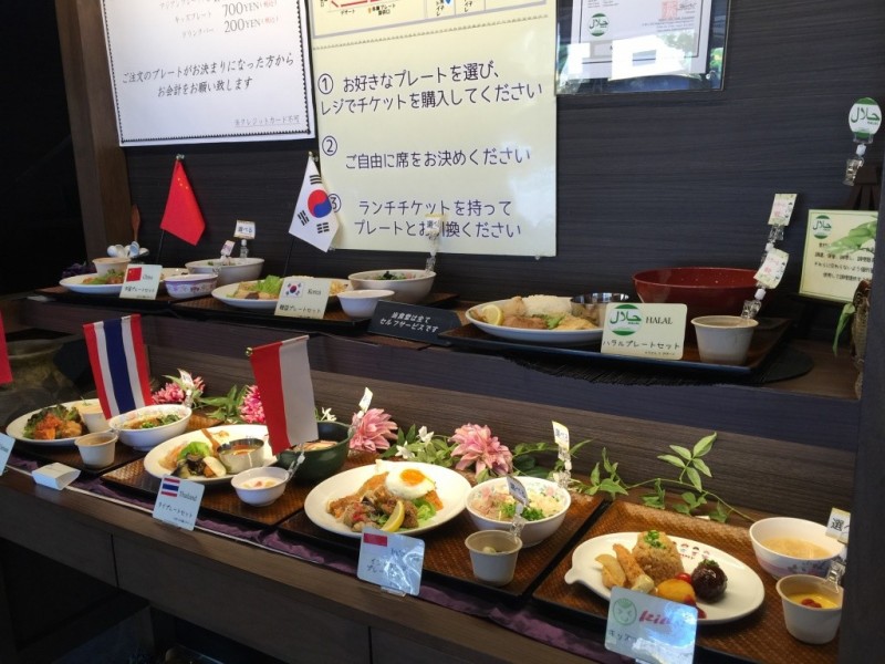

This university has many canteens because there are lots of students enrolled here; one of the canteens’ names is 食神 “Shokujin”. This canteen offers various types of food with, of course, an affordable price for students. Muslim students shouldn't worry as this canteen also provides halal food. Students can eat here everyday, while the canteen is only accessible to the public on weekends.
Here, all halal foods are labeled as such, so that the buyer can distinguish which products are halal and which are not. While halal is a popular choice, there is also Indonesian cuisine served. The food is all amazingly delicious.
Here, all halal foods are labeled as such, so that the buyer can distinguish which products are halal and which are not. While halal is a popular choice, there is also Indonesian cuisine served. The food is all amazingly delicious.
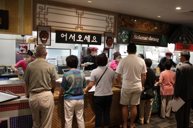
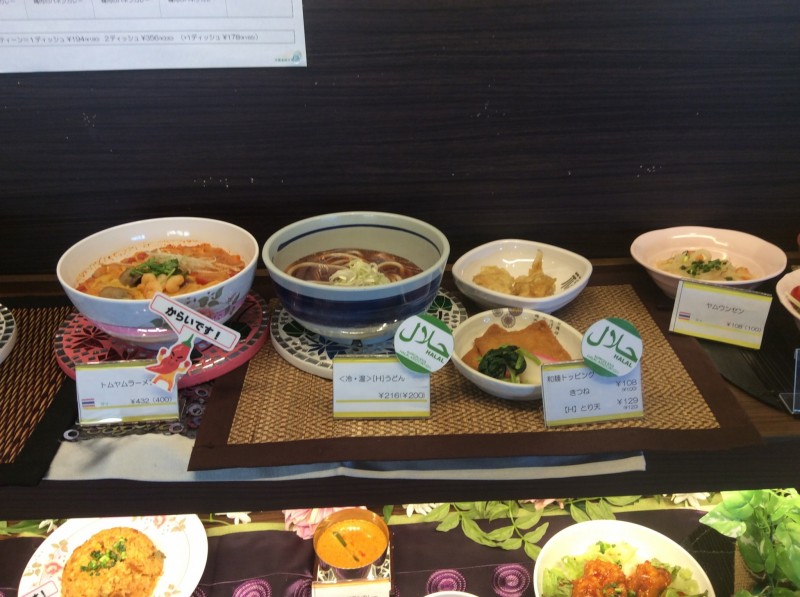
Furthermore, for Muslims who want to pray, this canteen also provides a praying room.
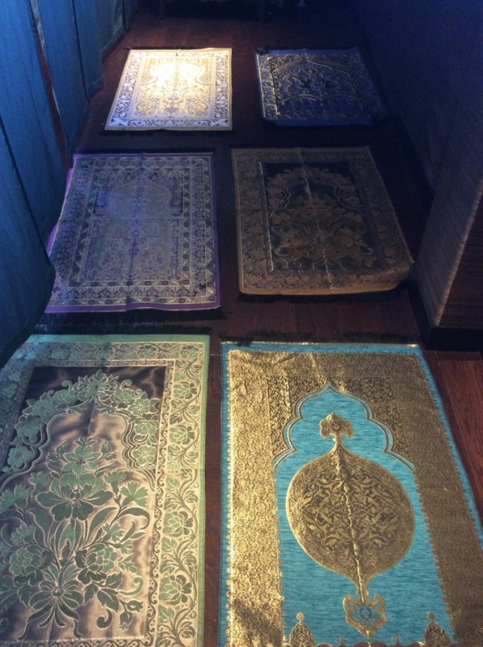
This praying room called "礼拝室" (reihaishitsu) or for us, Muslims, it is called Musholla. This Musholla is located on the 2nd floor of the "食神" and it also provides sajjada (prayer rugs) and sarong (a type of clothing) in a limited quantity for Muslims following Sholat (the five daily prayers).
The Halal Canteen at Kanda University is accessible to the public only on weekends.
The Halal Canteen at Kanda University is accessible to the public only on weekends.
- February 10, 2016
- Comment (7546)
- Trackback(0)
Comment(s) Write comment
Users who prioritize efficiency in online shopping often prefer platforms that load quickly and remain stable when they reach <a href="https://clevergoodsarena.shop" /> Arena Goods Quick Shop </a> because it allows them to browse comfortably without delays or interruptions while exploring different product categories easily.
-
Charlesvof Web Site
- 30/4 21:22
While conducting usability evaluations of ecommerce platforms focused on cart and checkout optimization, I noticed that adaptable cart systems improve browsing flow and purchase completion, which stood out when exploring <a href="https://freshcartoptions.shop/" />dynamic checkout cart hub</a> – The cart feels flexible, and the checkout process is quick, simple, and user friendly.
-
Georgenot Web Site
- 30/4 21:19
Across multiple evaluations of idea generation platforms, clarity of design and smooth interaction flow are consistently recognized as essential elements for effective user engagement <a href="https://purevalueoutlet.shop/" />Pure Outlet Value Studio</a> – the system provides an intuitive environment where users can easily discover content and develop creative ideas without distraction or confusion.
-
ShawnHAUFF Web Site
- 30/4 21:17
While going through web directories, I noticed <a href="https://onecentraluk.com/" />this central UK info page</a> and had a good first impression, as the content appears organized and useful, making the browsing experience feel smooth and straightforward overall.
-
ShaneFak Web Site
- 30/4 21:16
As I continued exploring cinema-related websites, I noticed <a href="https://folieadeuxfilm.com/" />this Folie a Deux film project hub</a> and film related content appears artistic, engaging, and thoughtfully presented style, presenting content in a way that feels creative and immersive.
-
GabrielPleax Web Site
- 30/4 21:13
As I continued reviewing several websites, I found <a href="https://daisystonegalleria.shop" />check this resource</a> – It offers a simple layout that works well, and pages are straightforward and easy to read, keeping everything easy to access.
-
DouglasDoN Web Site
- 30/4 21:10
While exploring several online options, I came across <a href="https://frostcovecommerceatelier.shop/" />visit here now</a> – It has a clean design style, and nothing feels cluttered while browsing through sections, which makes the experience smooth and clear.
-
Steveroada Web Site
- 30/4 21:01
Shoppers who prefer well structured digital retail spaces often look for platforms that emphasize clarity and elegance in product listings for easier navigation and selection <a href="https://dawnridgegoodsatelier.shop/" />Dawn Ridge Goods Studio</a> – featuring a clean and organized e commerce platform where products are presented with refined layout design and visual balance designed to improve browsing efficiency and enhance user satisfaction
-
Dannypex Web Site
- 30/4 20:53
People searching for organized digital stores often appreciate when they encounter resources like <a href="https://dynamicgoodscorner.shop/" />goods discovery center which presents products in a structured way helping users browse efficiently compare options easily and enjoy a more seamless online shopping experience overall across devices today
-
AlbertStola Web Site
- 30/4 20:53
Users exploring e-commerce sites frequently prefer clean interfaces and responsive design especially when visiting <a href="https://driftorchardmerchantmart.shop/" /> Orchard Merchant Outlet Zone </a> Pages load quickly and content is presented clearly making browsing smooth efficient and enjoyable for users who want a simple and structured shopping experience throughout their session.
-
Robertscunk Web Site
- 30/4 20:46
During a comparative analysis of online marketplaces focused on checkout systems and cart usability, I discovered that flexible cart options improve purchase efficiency, which stood out when exploring <a href="https://freshcartoptions.shop/" />fast checkout cart hub</a> – The cart options appear versatile, and the checkout flow is simple, smooth, and efficient overall.
-
Georgenot Web Site
- 30/4 20:40
In the middle of checking various resources, I discovered <a href="https://daisystonegalleria.shop" />check out this page</a> – It has a simple layout that works well, and pages are straightforward and easy to read, keeping navigation clean and simple.
-
DouglasDoN Web Site
- 30/4 20:39
Individuals exploring new fashion ideas often prefer online platforms that showcase modern clothing with aesthetic inspired designs suitable for everyday styling <a href="https://twelveandfaye.com/" />Modern Elegance Fashion Hub</a> – presenting a curated clothing platform that emphasizes stylish apparel aesthetic design principles and wearable fashion collections tailored for individuals seeking balanced and contemporary wardrobe inspiration
-
StevenClent Web Site
- 30/4 20:39
Many e-commerce users look for platforms that support quick browsing and dependable service for everyday needs, and a good example is <a href="https://goodsdockmarket.shop/" />Reliable Goods Harbor</a> – It focuses on providing a structured marketplace where customers can explore products efficiently while benefiting from consistent availability and straightforward navigation tools.
-
BruceHeple Web Site
- 30/4 20:38
Jaimecox Web Site- 30/4 21:25