
Loading

Search
▼ Halal Canteen at Kanda University
- Category:Gourmet

A Muslim Heaven in Japan
Halal food in Japan, is there any? Here's my story about Halal Canteen at Kanda University, Chiba.
I'm a student of Scholarship Featured Program, studying in KUIS (Kanda University of International Studies). This university is located in Chiba City. The address is 1-4-1, Wakaba, Mihama-ku, Chiba-shi, Chiba-ken, 261-0014, Japan. This university specializes in language courses. Therefore, various languages from many countries, such as Spanish, Chinese, Korean and, of course, Indonesian language also, are offered here.
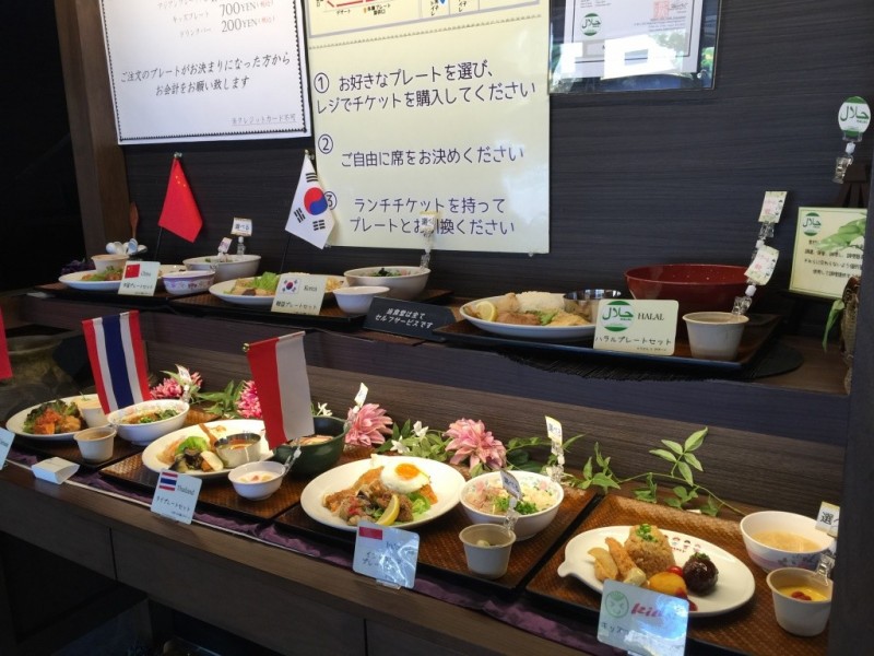

This university has many canteens because there are lots of students enrolled here; one of the canteens’ names is 食神 “Shokujin”. This canteen offers various types of food with, of course, an affordable price for students. Muslim students shouldn't worry as this canteen also provides halal food. Students can eat here everyday, while the canteen is only accessible to the public on weekends.
Here, all halal foods are labeled as such, so that the buyer can distinguish which products are halal and which are not. While halal is a popular choice, there is also Indonesian cuisine served. The food is all amazingly delicious.
Here, all halal foods are labeled as such, so that the buyer can distinguish which products are halal and which are not. While halal is a popular choice, there is also Indonesian cuisine served. The food is all amazingly delicious.
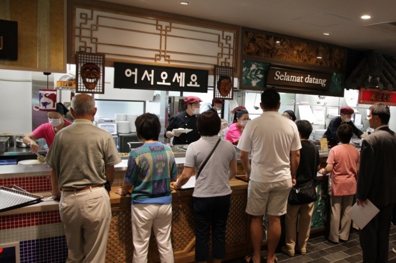
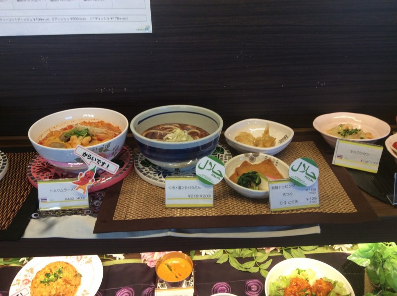
Furthermore, for Muslims who want to pray, this canteen also provides a praying room.
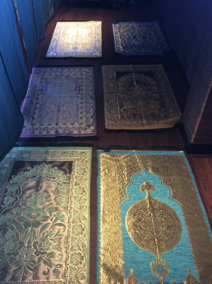
This praying room called "礼拝室" (reihaishitsu) or for us, Muslims, it is called Musholla. This Musholla is located on the 2nd floor of the "食神" and it also provides sajjada (prayer rugs) and sarong (a type of clothing) in a limited quantity for Muslims following Sholat (the five daily prayers).
The Halal Canteen at Kanda University is accessible to the public only on weekends.
The Halal Canteen at Kanda University is accessible to the public only on weekends.
- February 10, 2016
- Comment (7558)
- Trackback(0)
Comment(s) Write comment
During a casual browsing session across different websites, I noticed <a href="https://quickstoneboutiquehall.shop/" />visit this link</a> – It presents a clean interface with a straightforward structure, which makes understanding the layout fast and effortless while navigating through different sections.
-
BillyCal Web Site
- 30/4 23:19
Online users who want better organization in shopping platforms often rely on <a href="https://dynamicpickhub.shop/" />Choice explorer station</a> which simplifies navigation across different product groups and enhances clarity while browsing allowing users to make informed decisions quickly without feeling overwhelmed by excessive information – system supports user friendly exploration.
-
Jesusciz Web Site
- 30/4 23:15
When people explore online learning tools designed for innovation and brainstorming, they often prefer platforms that combine structure with creative flexibility and ease of use <a href="https://purevalueoutlet.shop/" />Value Creative Flow Portal</a> – the site delivers a smooth experience that encourages curiosity and supports users in building and refining their ideas through intuitive interaction design.
-
Davidsuene Web Site
- 30/4 23:05
Many users browsing online stores prefer platforms with organized layouts and clear structure especially when accessing <a href="https://frostseasidegoodsdistrict.shop/" /> Frost Goods District Seaside </a> The site has a neat appearance and everything is structured in a way that makes browsing smooth and efficient for users.
-
Rogeramacy Web Site
- 30/4 23:04
Online retail platforms that prioritize usability and clarity tend to attract more engaged users who value structured browsing and quick access to products <a href="https://clevergoodsstation.shop" /> Goods Station Explorer </a> – Intuitive design ensures users can move between categories easily while maintaining focus on relevant items and enjoying a smooth overall shopping journey.
-
RobertPlago Web Site
- 30/4 23:01
In the middle of checking different platforms, I came upon <a href="https://creekharbortrading.shop" />discover this trading link</a> – The smooth experience overall makes navigation feel quick and very user friendly, giving a simple and efficient browsing flow.
-
Francisprelp Web Site
- 30/4 22:48
Individuals interested in trendy clothing often explore online fashion platforms that highlight aesthetic inspired designs and modern wardrobe essentials <a href="https://twelveandfaye.com/" />Fashion Aesthetic Collection Space</a> – presenting a curated selection of stylish apparel focused on modern design trends aesthetic appeal and wearable comfort for individuals who value creativity simplicity and elegant fashion expression
-
StevenClent Web Site
- 30/4 22:47
While checking classic resale curation sites, I came across <a href="https://prelovedbyalexandratolstoy.com/" />classic preloved curation space</a> and the collection feels timeless, with a strong focus on elegance and careful selection of every displayed item. – The experience feels calm, structured, and visually appealing today now experience.
-
GeorgeTrups Web Site
- 30/4 22:45
While conducting comparative research on ecommerce browsing systems and interface design, I observed that stacked layouts help reduce navigation complexity and improve content visibility, which became clear when testing <a href="https://shopstackmarket.shop/" />smart scroll shopping hub</a> – The interface feels clean and structured, allowing users to browse products easily through a stacked and scroll friendly layout.
-
ByronUnept Web Site
- 30/4 22:45
While reviewing ecommerce systems designed for speed optimization and responsive shopping, I noticed that fast cart corners improve browsing ease and satisfaction, which stood out when exploring <a href="https://quickcartcorner.shop/" />lightning fast cart hub</a> – The shopping corner feels quick and efficient, with pages loading almost instantly.
-
EduardoBak Web Site
- 30/4 22:41
Individuals who enjoy simple and functional online shopping environments often use merchant inspired platforms that prioritize ease of use and organized product discovery <a href="https://bayharbormerchantmart.shop/" />Everyday Shopping Merchant Hub</a> – offering a clean and practical marketplace designed to help users browse items efficiently compare options easily and complete purchases without unnecessary complexity in their online shopping experience
-
RickyLic Web Site
- 30/4 22:38
wellbutrin people pharmacy <a href=https://pharmseepaa.com/>sildenafil citrate online pharmacy</a> online pharmacy free viagra samples
-
Brmgycle Web Site
- 30/4 22:38
While analyzing ecommerce UX designs centered on navigation and clarity, I observed that shopping hubs improve engagement and usability, which was evident when reviewing <a href="https://directshoppinghub.shop/" />efficient browse shopping center</a> – The shopping experience is smooth, and switching between sections feels natural and easy.
-
AnthonyOxinc Web Site
- 30/4 22:35
While reviewing different online platforms, I stumbled upon <a href="https://harborbrookvendorfoundry.shop/" />explore this site</a> – It appears well structured, and navigation feels natural and very straightforward, making the browsing experience easy and intuitive.
-
ArronSkifs Web Site
- 30/4 22:34
EduardoBak Web Site- 30/4 23:19