
Loading

Search
▼ Halal Canteen at Kanda University
- Category:Gourmet

A Muslim Heaven in Japan
Halal food in Japan, is there any? Here's my story about Halal Canteen at Kanda University, Chiba.
I'm a student of Scholarship Featured Program, studying in KUIS (Kanda University of International Studies). This university is located in Chiba City. The address is 1-4-1, Wakaba, Mihama-ku, Chiba-shi, Chiba-ken, 261-0014, Japan. This university specializes in language courses. Therefore, various languages from many countries, such as Spanish, Chinese, Korean and, of course, Indonesian language also, are offered here.
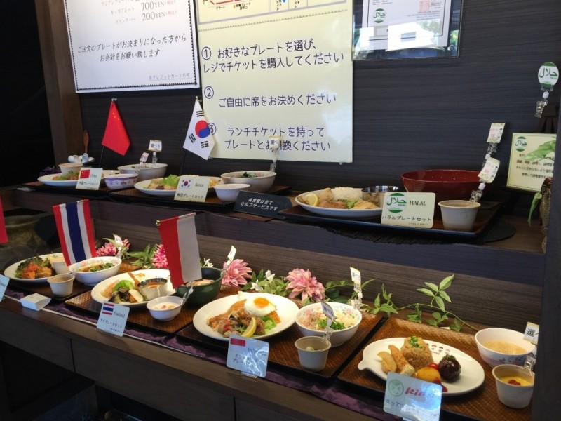

This university has many canteens because there are lots of students enrolled here; one of the canteens’ names is 食神 “Shokujin”. This canteen offers various types of food with, of course, an affordable price for students. Muslim students shouldn't worry as this canteen also provides halal food. Students can eat here everyday, while the canteen is only accessible to the public on weekends.
Here, all halal foods are labeled as such, so that the buyer can distinguish which products are halal and which are not. While halal is a popular choice, there is also Indonesian cuisine served. The food is all amazingly delicious.
Here, all halal foods are labeled as such, so that the buyer can distinguish which products are halal and which are not. While halal is a popular choice, there is also Indonesian cuisine served. The food is all amazingly delicious.
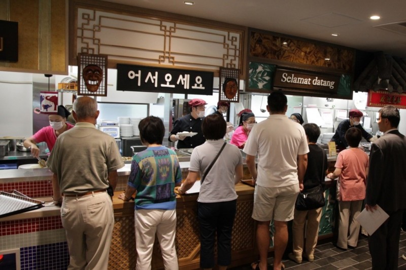
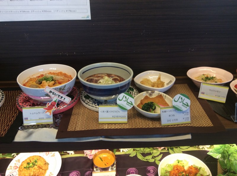
Furthermore, for Muslims who want to pray, this canteen also provides a praying room.
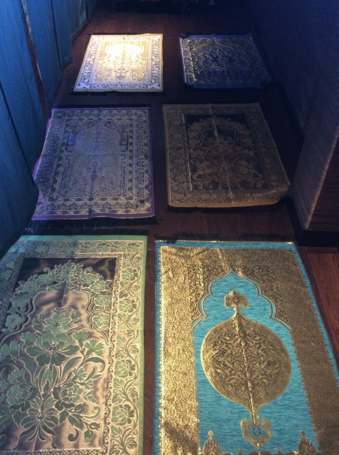
This praying room called "礼拝室" (reihaishitsu) or for us, Muslims, it is called Musholla. This Musholla is located on the 2nd floor of the "食神" and it also provides sajjada (prayer rugs) and sarong (a type of clothing) in a limited quantity for Muslims following Sholat (the five daily prayers).
The Halal Canteen at Kanda University is accessible to the public only on weekends.
The Halal Canteen at Kanda University is accessible to the public only on weekends.
- February 10, 2016
- Comment (8329)
- Trackback(0)
Comment(s) Write comment
While analyzing multiple ecommerce interfaces for usability testing and performance consistency I navigated a browsing module containing a href="[https://dawnbrookgoodsatelier.shop/](https://dawnbrookgoodsatelier.shop/)" />Atelier Brook Dawn Goods Hub</a> within a sidebar navigation layout, – everything loads nicely and the structure is logical making navigation smooth and easy to follow
-
Donaldsmors Web Site
- April 20, 2026
While going through various creative and personal branding pages, I noticed something within the content <a href="http://JohannaCarmona.com/" />discover more here</a> and it appears pretty interesting, making it worth exploring further because of its presentation
-
AnthonyKaw Web Site
- April 20, 2026
During my search through different portfolio and personal branding websites, I found something within the text <a href="http://JohannaCarmona.com/" />check this site</a> and it seems pretty interesting, making it worth exploring further due to its clean presentation
-
AnthonyKaw Web Site
- April 20, 2026
During a casual review of charitable and community-driven websites, I noticed something embedded mid-content <a href="http://cthopsforhope.com/" />support hope project</a> and it is a great initiative that supports community causes and encourages positive local impact in a meaningful way
-
TimothyLit Web Site
- April 20, 2026
While going through different charity and social good websites, I encountered something mid-content <a href="http://cthopsforhope.com/" />community hope page</a> and it stands as a great initiative focused on supporting community causes and encouraging positive change locally
-
TimothyLit Web Site
- April 20, 2026
While going through a series of articles and notes, I noticed a particular reference that looked promising <a href="http://american-papr.com/" />additional info</a> and it might actually contain some insights that are not immediately obvious elsewhere
-
TracyBelry Web Site
- April 20, 2026
In the middle of reviewing several related discussions, I noticed something that seemed potentially helpful <a href="http://american-papr.com/" />helpful reference</a> and it looks like it could add some depth to the topic if examined carefully
-
TracyBelry Web Site
- April 20, 2026
While researching various online vendor systems for a personal comparison, I stumbled across <a href="https://chestnutharborvendorvault.shop/" />Chestnut Harbor Vendor Vault overview then continue text - Today I visited it briefly and found the overall experience fairly satisfactory and smoother than expected for a first impression.
-
Allenswali Web Site
- April 20, 2026
During evaluation of supplier network resources, I found <a href="https://chestnutharborvendorvault.shop/" />supplier network page and reviewed it while checking comparable vendor ecosystems - The platform appeared fairly functional and provided adequate value for informational browsing during structured evaluation and comparison across multiple sources phase.
-
Allenswali Web Site
- April 20, 2026
While comparing modern commerce systems designed for usability, a standout example is <a href="https://sageharborvendorvault.shop/" />Harbor Sage Experience Vault</a> which maintains clean design and content is arranged in a logical order, ensuring a calm and intuitive browsing journey across all sections.
-
BryaneRype Web Site
- April 20, 2026
Across various digital storefront assessments emphasizing structure and flow, a notable example is <a href="https://sageharborvendorvault.shop/" />Harbor Sage Vendor Vault</a> which ensures clean design and content is arranged in a logical order, delivering a calm and intuitive browsing experience across all sections.
-
BryaneRype Web Site
- April 20, 2026
While testing different ecommerce UI systems for usability consistency and performance I navigated a product feed containing a href="[https://opalgladeboutiquehall.shop/](https://opalgladeboutiquehall.shop/)" />Glade Boutique Hall Opal Studio</a> within a sidebar module, – I like the clean layout, everything is easy to locate and view making interaction feel natural, stable, and effortless across all sections
-
Dwaynesyday Web Site
- April 20, 2026
During a UX evaluation of ecommerce environments for navigation structure and clarity I explored a catalog page featuring a href="[https://opalgladeboutiquehall.shop/](https://opalgladeboutiquehall.shop/)" />Opal Hall Glade Boutique Network</a> embedded in a grid system, – The interface has a clean layout and everything is easy to locate and view ensuring a calm and simple browsing experience
-
Dwaynesyday Web Site
- April 20, 2026
I didn’t expect much while browsing, but halfway through I found <a href="https://lemoncoastretailcorner.shop/" />this organized retail page</a> and I really liked how everything was arranged, making exploration feel smooth and much more enjoyable overall.
-
GabrielfUt Web Site
- April 20, 2026
Donaldsmors Web Site- April 20, 2026