
Loading

Search
▼ Halal Canteen at Kanda University
- Category:Gourmet

A Muslim Heaven in Japan
Halal food in Japan, is there any? Here's my story about Halal Canteen at Kanda University, Chiba.
I'm a student of Scholarship Featured Program, studying in KUIS (Kanda University of International Studies). This university is located in Chiba City. The address is 1-4-1, Wakaba, Mihama-ku, Chiba-shi, Chiba-ken, 261-0014, Japan. This university specializes in language courses. Therefore, various languages from many countries, such as Spanish, Chinese, Korean and, of course, Indonesian language also, are offered here.
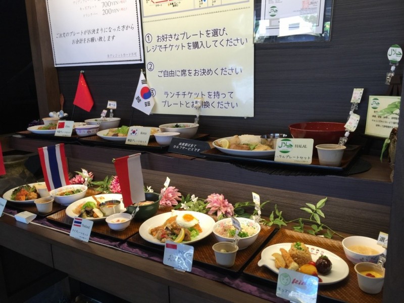

This university has many canteens because there are lots of students enrolled here; one of the canteens’ names is 食神 “Shokujin”. This canteen offers various types of food with, of course, an affordable price for students. Muslim students shouldn't worry as this canteen also provides halal food. Students can eat here everyday, while the canteen is only accessible to the public on weekends.
Here, all halal foods are labeled as such, so that the buyer can distinguish which products are halal and which are not. While halal is a popular choice, there is also Indonesian cuisine served. The food is all amazingly delicious.
Here, all halal foods are labeled as such, so that the buyer can distinguish which products are halal and which are not. While halal is a popular choice, there is also Indonesian cuisine served. The food is all amazingly delicious.
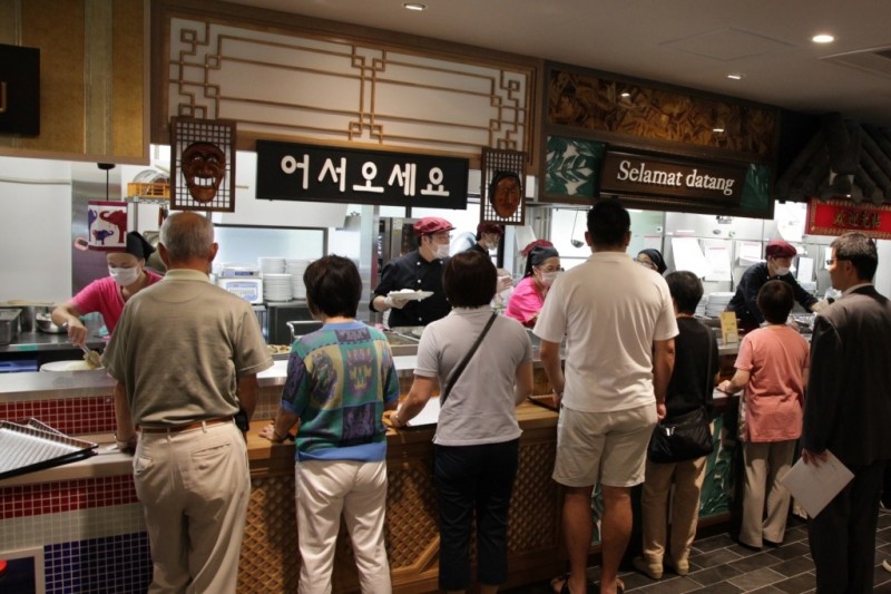
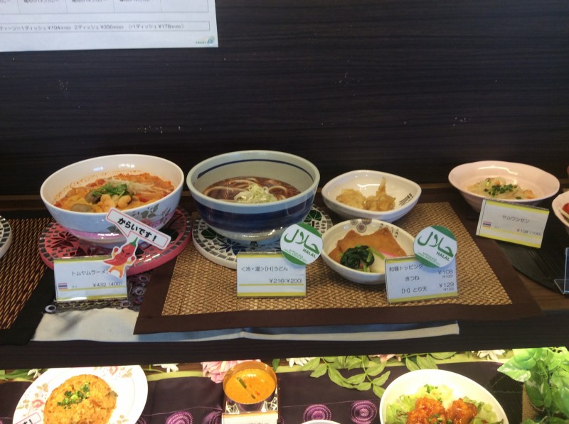
Furthermore, for Muslims who want to pray, this canteen also provides a praying room.
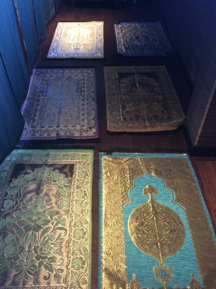
This praying room called "礼拝室" (reihaishitsu) or for us, Muslims, it is called Musholla. This Musholla is located on the 2nd floor of the "食神" and it also provides sajjada (prayer rugs) and sarong (a type of clothing) in a limited quantity for Muslims following Sholat (the five daily prayers).
The Halal Canteen at Kanda University is accessible to the public only on weekends.
The Halal Canteen at Kanda University is accessible to the public only on weekends.
- February 10, 2016
- Comment (8310)
- Trackback(0)
Comment(s) Write comment
For professionals seeking reliable networks, exploring <a href="https://trustedbusinesslink.bond/" />business success hub</a> – a trust-based platform enables transparent collaboration, helping organizations grow through strong partnerships and consistent professional support systems.
-
Waltertunda Web Site
- May 7, 2026
While browsing through creative technology sites, I noticed <a href="https://nextgeninnovation.shop/" />next generation hub</a> – The idea behind it feels forward-thinking, offering a sense that it could be focused on new and promising innovations in various fields.
-
OscarNus Web Site
- May 7, 2026
As I explored online stores for new clothing and style upgrades, I included <a href="https://freshfashionfinds.cfd/" />visit trendy fashion site</a> in my notes – the jacket I ordered matched the photos perfectly and it made the whole shopping experience feel reliable.
-
Marvinslunk Web Site
- May 7, 2026
Users comparing online platforms often look for consistency in layout, clean design elements, and how well the interface supports easy access to information across all pages <a href="http://urbanscale.click/" />UrbanScale Navigation Portal</a> – UrbanScale provides a visually clear and structured experience where balanced layout design makes browsing smooth, efficient, and easy for users to follow naturally.
-
Wilfordepigh Web Site
- May 7, 2026
Many beginners in trading often look for easy-to-follow guides, and I recently explored <a href="https://learntradingtoday.cfd/" />Learn Trading Guide Hub</a> which looks helpful – The explanations are clear and interesting, avoiding boring technical language and making the learning experience more enjoyable and easier for newcomers to understand step by step.
-
Ellisliz Web Site
- May 7, 2026
Individuals exploring digital growth opportunities often evaluate platforms that promise international connectivity and collaborative thinking <a href="https://globalnetworkvision.bond/" />worldwide vision exchange</a> supporting conversations that can lead to innovative business concepts and shared initiatives – The global reach is truly notable and I am looking forward to its continued progress
-
Robertjub Web Site
- May 7, 2026
Many users seeking better opportunities explore <a href="https://learnandearndaily.click/" />daily skill earning guide</a> – a helpful resource that focuses on combining education with income generation strategies for consistent improvement and digital success over time.
-
Dennishoumb Web Site
- May 7, 2026
Decorating my home has become a hobby, and I often try new stores to find unique items that match my interior style preferences <a href="https://uniquedecorstore.cfd/" />modern interior decor shop</a> I ordered two vases and they were packaged so securely that there was absolutely no damage when they arrived at my doorstep
-
Hollisexoke Web Site
- May 7, 2026
Earlier today I stumbled upon a page while browsing that felt quite informative and decided to mention it here for others to check out <a href="https://profitgoalsystem.cfd/" />profit path guide</a> – I found it interesting and the content seems pretty straightforward, making it easy to explore
-
JosephRotly Web Site
- May 7, 2026
People learning about financial markets often prefer academy-style platforms that guide them step by step, and I recently explored <a href="https://protraderacademy.bond/" />Trader Education Pro Academy Hub</a> which feels organized – A structured trading education platform offering course-style learning, and at first glance it gives a promising impression for users who want a clear and guided introduction to trading.
-
Gregorylap Web Site
- May 7, 2026
When reviewing web design samples focused on clarity and responsiveness, users often note that platforms such as <a href="http://primeimpact.click/" />impact portal view</a> appear in collections aimed at demonstrating clean interface structure and easy navigation patterns for improved user interaction analysis. – The layout is typically seen as smooth, consistent, and easy to follow.
-
Ralphnax Web Site
- May 7, 2026
Online shoppers searching for dependable deals often discover platforms such as <a href="https://everydayvaluefinds.shop/" />Practical Savings Corner</a> which lists useful goods, and it enhances browsing by offering streamlined suggestions – helping users quickly identify affordable items that align with their routine shopping needs and financial plans.
-
StanleyTat Web Site
- May 7, 2026
Online shoppers increasingly appreciate platforms that support awareness and thoughtful decision-making during browsing sessions, including <a href="https://shopwithpurpose.shop/" />Conscious Buying Portal</a> which is often described as a user-friendly space that encourages reflection, helps compare alternatives effectively, and allows individuals to continue exploring meaningful products that better suit their lifestyle priorities and financial planning.
-
Brianmig Web Site
- May 7, 2026
Forward looking entrepreneurs often engage with platforms designed to enhance global communication networks <a href="https://globalnetworkvision.bond/" />global entrepreneur vision link</a> helping build bridges between different business ecosystems and professional environments – The global expansion potential is strong and I am excited to watch it grow
-
Robertjub Web Site
- May 7, 2026
DouglasObess Web Site- May 7, 2026