
Loading

Search
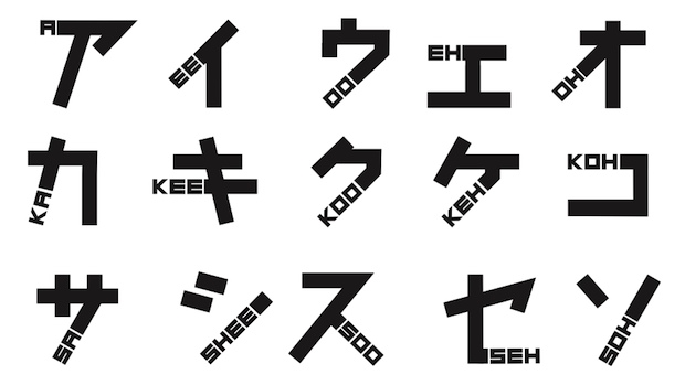
▼ Phonetikana by Johnson Banks: A katakana font for foreigners
- Category:Other
JAPANTRENDS
UK design studio Johnson Banks has come up with this brilliant take on Japanese katakana that combines the phonetical reading of the character in the font.
They call it Phonetikana.
The font came out in 2009 but for some reason Japanese and other blogs have just discovered it. It’s a nice idea for making Tokyo signage more accessible to foreign visitors at the 2020 Olympics.
Multiple trips to Japan and constant frustration at being unable to read the language has sparked off an unusual typographic project at johnson banks. Earlier in the year we started seeing if we could combine the English language and Japanese script in some way.
One of the three typographic styles that is used in Japan is essentially phonetic, and is called Katakana. We’ve been attempting to find ways to incorporate phonetic sounds with the Katakana letterforms.


- October 21, 2014
- Comment (0)
- Trackback(0)